Resy Features National Los Angeles New York
The Artist Jake Clark Has Many Muses, and They’re All Classic Restaurants
Published:
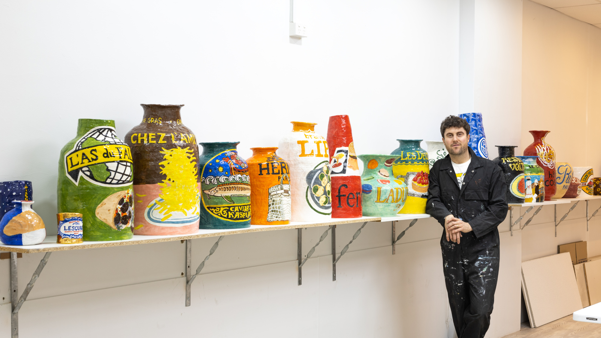
The artist Jake Clark is known for his colorful ceramic tributes to the classic restaurants of New York, Los Angeles, Miami, and beyond. He’s painted vases with tottering pastel pastrami sandwiches in the style of Canter’s Deli; dotted a fire hydrant-red handmade Bemelmans ashtray with ceramic cigarette butts and pimento olives; and made a volcano-shaped vessel with a giant raw steak dripping into the Peter Luger logo below, to name a few.
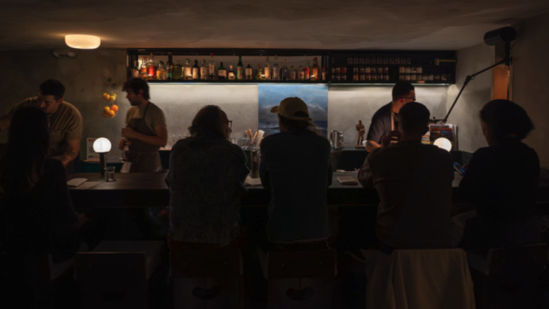
Those familiar with Clark’s work might be surprised to learn, however, that despite his Americana-steeped output, Clark was born in Melbourne, Australia, and practiced from there until a recent move to New York. Nowadays, he constructs his ceramic pots and ashtrays at his studio in Gowanus, Brooklyn. For Clark, who spent his childhood traveling back and forth from Australia to America, institutions like Raoul’s, Nate‘n Al’s Deli, and Joe’s Stone Crab have been a regular source of inspiration.
“There’s something so iconic about all the different logos and aesthetics of these places,” he says. “I just love all of the colors.” Old-school restaurants happen to be where the artist prefers to dine. “I like food, but I’m not super fussed about it,” he says. “I like going to older places that just do their things well.” The look and feel of restaurants that have stood the test of time — many of them designed in the ‘70s and ‘80s — appeals to him most. Restaurants with a strong visual personality tend to lodge themselves in his creative brain.
Clark hand-builds all of his ceramics with coils of clay, then fires each piece three times before painting several layers of underglaze to create the vibrancy in his colors. The paintings on top of each sculpture are based on the colors and the signage of a particular restaurant, plus his own experience eating there. Sometimes that means recreating iconic dishes, though not always — Clark’s pieces evoke the memories of many senses, combined.
Here, the artist walks us through his process for seven of his most inspired restaurant-inspired pieces.
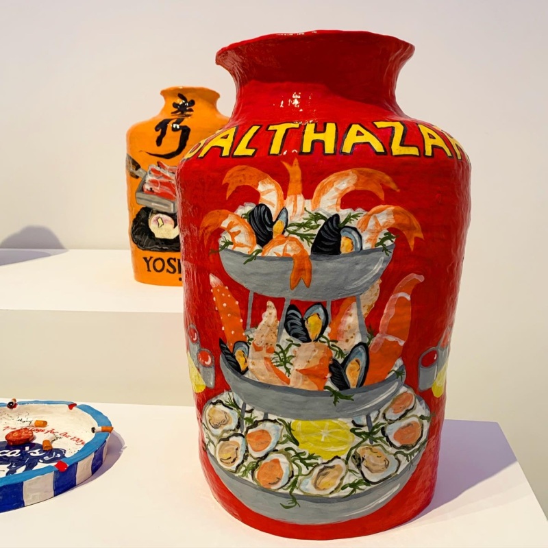
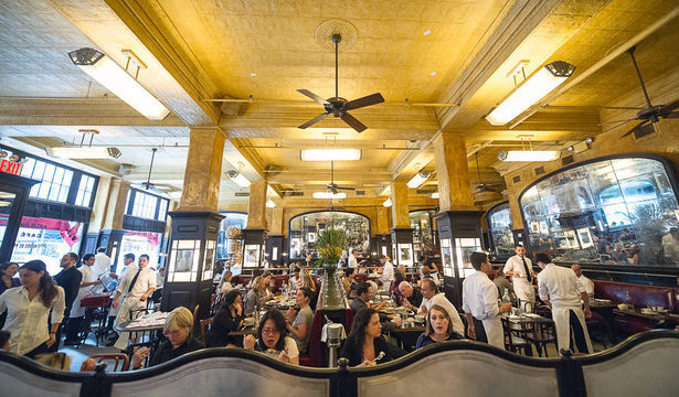
Balthazar, New York
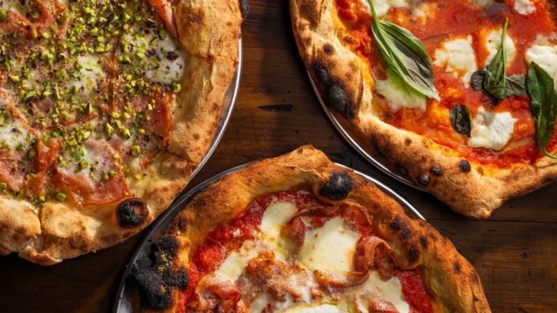
“Before [I moved to New York], I was living here for a few months, and went to Balthazar a bunch of times. I love Balthazar, it’s a New York staple. We had a really nice night there with my mom and some family friends, where we ended up getting the seafood tower. I knew that it had to be included [in a piece], and I wanted to do a big pot so I could showcase the whole tower. I went with that darkish bright red and obviously the yellow logo. I like to paint images of the food that I ate at the place. Sometimes, it’s not the exact dish people associate with a restaurant, but it’s what I liked.”
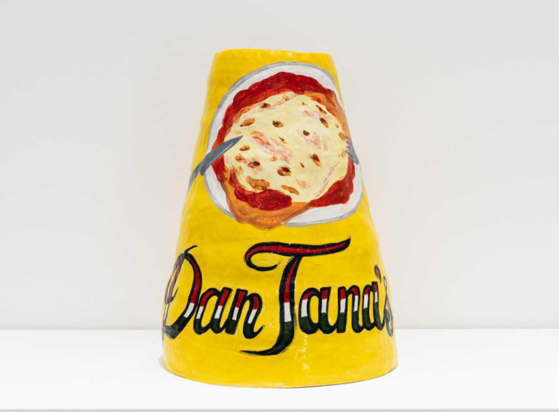
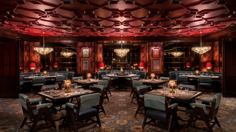
Dan Tana’s, Los Angeles
“Every time I go to Dan Tana’s, I get the big chicken parm with spaghetti Bolognese next to it. It’s so over the top, but I kind of like that because I think my pieces are quite in-your-face as well. The food is not the best, but there are characters in that place: the people who are sitting around the bar, the regulars. And the decor, there’s something very American-Italian about it. It’s so grand in an American way, there’s so much going on in there. Dan Tana’s is a place I love to go to when I’m in town, for a meal, and just to people watch.”
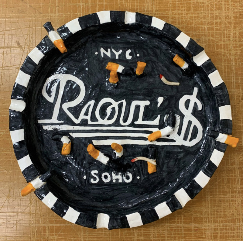
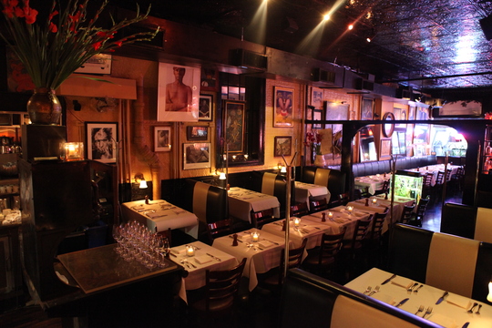
Raoul’s, New York
“I don’t smoke, but I love ashtrays. And my grandparents, who were smokers when I was younger, used to have really cool ones. I sometimes have leftover bits of clay from making pots, so I started making smaller and flatter dishes, and I started adding cigarette butts with the ends of the leftover clay coils. I went with the same concept — I wanted to make places that resonated with me. Raoul’s is one of my favorite restaurants. For me, it’s about the signage and the neon lights in the window, and the black and white striped awning in the front. I thought it would be nice to include their awning because it’s very recognizably Raoul’s.”
More From Resy


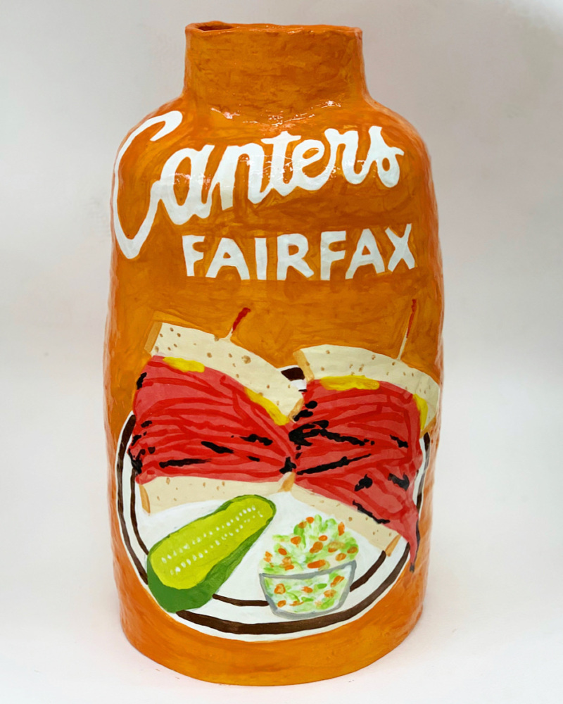
Canter’s, Los Angeles
“Canter’s was the place I’d go to when I was a bit younger after we’d go out to clubs. We’d end up there since it was open 24 hours. You could get a matzoh ball soup and a sandwich at 4 a.m. You can see Canter’s from a mile away when you’re on Fairfax. I love the dusty old orange building it’s in, and the sandwiches are amazing.
“I was always drunk when I went there, though, and when I’ve gone back recently, to take my daughter for a sandwich during the day, it’s not as good. It’s definitely better as a late-night spot. There are better places to eat that kind of food [laughs]. But it’s an L.A. institution. I always look up at the ceiling inside, with the glass leaves all over the roof. There’s so much detail, which catches my eye. You really remember a place like that.”
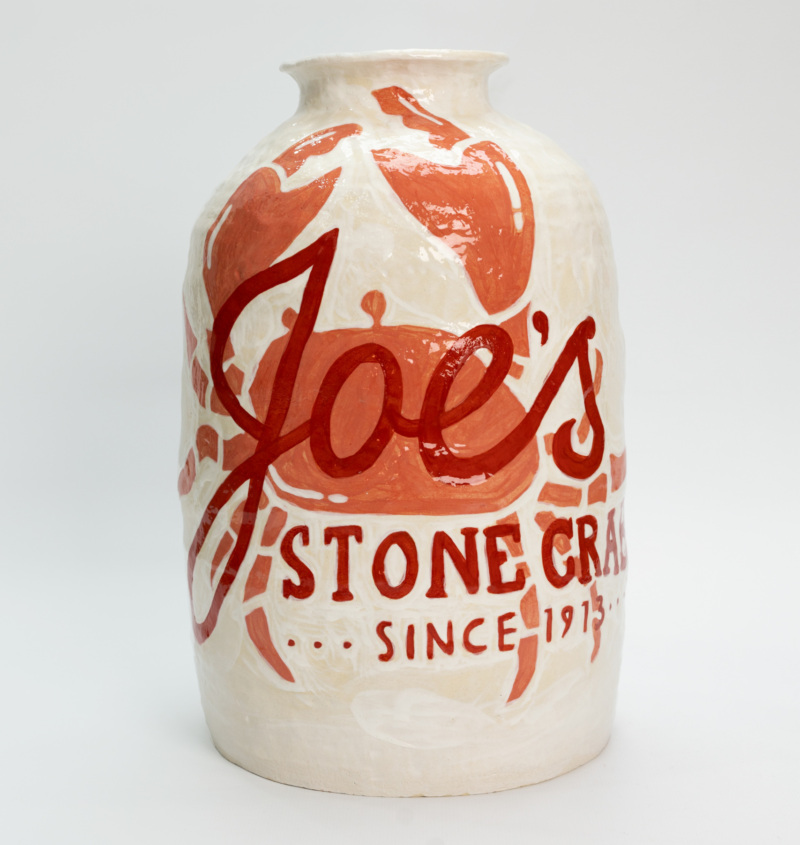
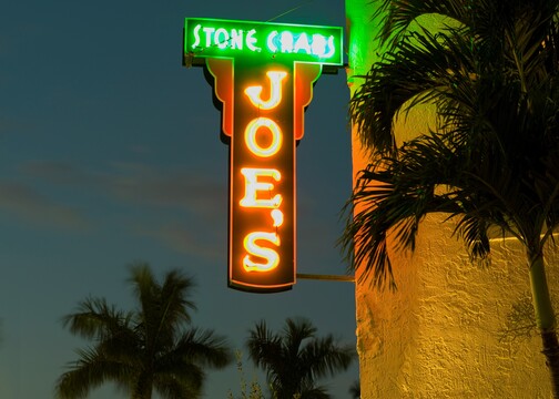
Joe’s Stone Crab, Miami
“This one was for Art Basel. There’s nowhere more Instagrammed than Joe’s Stone Crab. I wanted to paint the bib that everybody wears and takes photos with. Since this was for Miami, I figured, what’s more Miami than Joe’s?”
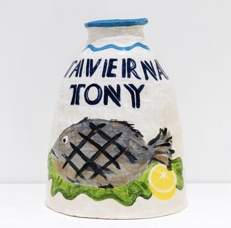
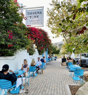
Taverna Tony, Malibu
“Taverna Tony is my favorite place to go to in Malibu. I always make sure to go to Taverna Tony and have a late lunch there. We’ve got a big Greek community back home in Melbourne, so there are a lot of great Greek restaurants. And I’ve never found anything in L.A. like that until I went to Taverna Tony years ago. I love the grilled fish, and the big sign that hangs down the front with the blue squiggly wave sitting above it.”
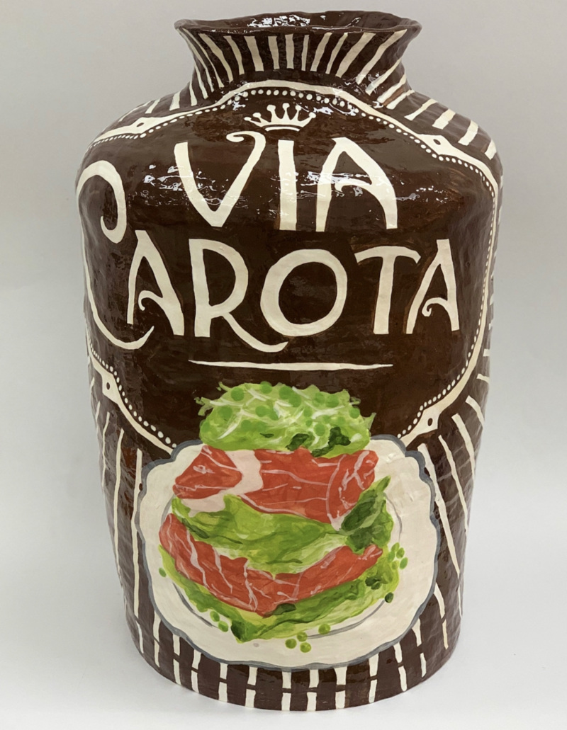
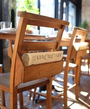
Via Carota, New York
“I’ve had so many good meals here, even their salads are amazing. The pastas are really good as well, but their salads and their branding [are what I like best]. I sometimes try to make the colors bounce off each other so the back color of the pot works with the image as well, and I like how the colors offset each other here.
“I love [sister restaurant] I Sodi too, but I feel like Via Carota has more character to it. There’s more to work with for me: the big logo and how the white stripes [emanate] from it. I don’t want to just make pieces about old institutions, although a majority of them are. There are definitely some newer places, like Via Carota, that I want to pay homage to as well.”